

An easy guide to depicting dialogue as text messages in a contemporary fiction novel.
Text messages are a part of everyday life so if you’re writing contemporary fiction there’s a good chance you’ll want to include a few in your story. But how do you format them? Should you use quote marks? Do you need to indicate the sender with a name or dialogue tag? What about emojis?! 🤪
There are a few options for fiction writers to choose from. Let’s take a look.
Keep it simple with italics
You could use quote marks, but because readers are so used to seeing quote marks with speech, it’s clearer to illustrate texts with some other kind of formatting.
The most straightforward way to show text messages in fiction is with italics, which are usually used to indicate any dialogue that isn’t spoken aloud.
You can add a dialogue tag or action beat to clarify who’s sending the text, as you would if they were speaking. For example:
Hey, I just pulled up, Trent texted.
Be there in a minute! I typed back.
Choose a different font
If your characters are spending a lot of time communicating this way, you might want to use a clear visual cue to indicate a text message convo. Select a different font (a sans serif font helps to distinguish it from the rest of the copy while giving a nod to tech formatting) and set it off with indents. For example:
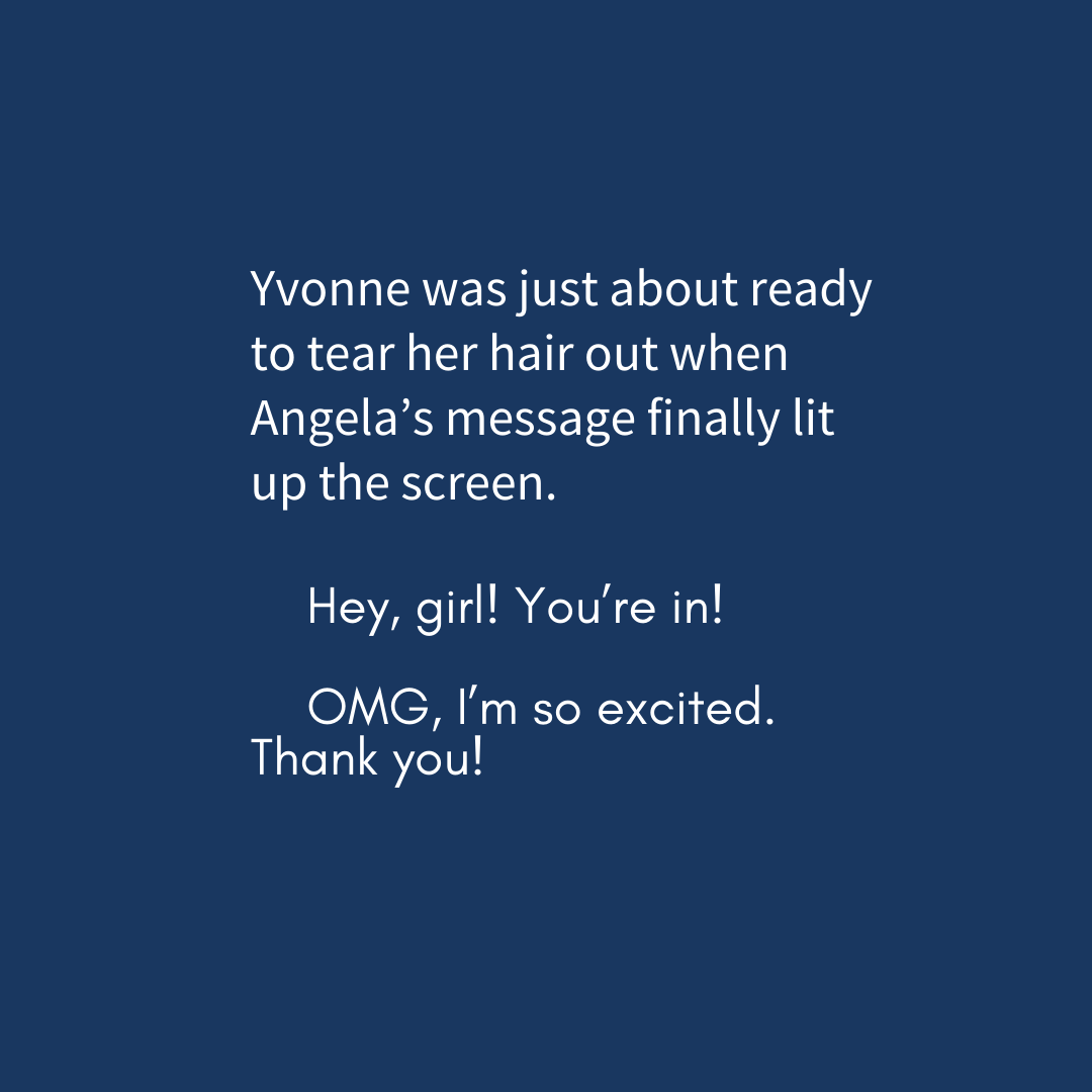
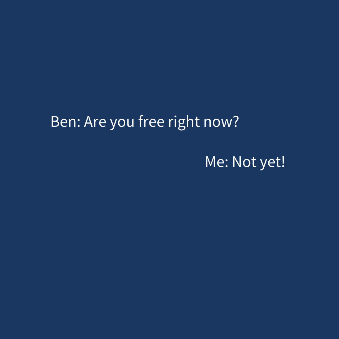
Use formatting to indicate sent and received texts
Think about how messages are displayed on your phone. The ones you send are aligned right and the ones you receive are aligned left. Some authors are choosing to replicate this format in their works, even placing them inside speech bubbles with dates and times for an authentic look. In this style, you might want to use names to indicate speakers, as you would in a play. For example:
Some authors – particularly young adult authors – might even like to work with a designer or illustrator to create a graphic treatment for texts.
How to choose?
Your choice of style to use will depend on a number of factors, including readability and budget.
Some questions to ask yourself include:
- Do you have long strings of text exchanges between characters?
- Will you ever have more than two people in a text chat?
- If you’re using names to discern who is sending the texts, how do you imagine them being read in an audio version?
- What age group are you writing for?
- Are you working with a designer/typesetter who can create a special design treatment for texts?
- Is space an issue?
- What’s your personal preference when reading this type of dialogue in fiction?
If you’re only using the odd text here and there, italics might be all you need. But if text messages are a critical part of your characters’ dialogue, consider using a special treatment, even if it’s just a different font.
You might like to try out a few different styles and see how they fit, and when you decide on one, ask your beta readers to give feedback on whether your treatment of text messages is clear and enjoyable to read.
What about emojis?
I love a smiley/winky/smirky face as much as the next millennial, but there are caveats to using these guys. Like fonts, emojis (that is, the little pictures, not the ones created with letters) are subject to copyright, so if you’re self-publishing, make sure to buy a licence or find a free version for your work. Also bear in mind that they won’t appear in colour in your printed book, which may lessen their visual appeal and impact.
Another thing to consider is the possibility that they will date your book. Emojis are popular now but they may be considered cringe in a few years’ time, or their meaning could shift. It’s something to keep in mind if you’re concerned about your work’s longevity in the market.
The verdict
As long as you’re making text messages and who’s sending them clear to your reader, there’s no real right or wrong here. I lean towards using a different font or italics to indicate text messages in fiction and weaving in some dialogue tags and action beats to keep readers on top of who’s texting at all times. If you’re working with a copy editor, you can ask them if they can set up a special style in Word for text messages when working on your book to ensure you achieve both consistency and clarity. This will ensure they’re typeset differently to the rest of your text too.
Ultimately, I love seeing creative ways of depicting technology in fiction and I’m excited to see how this evolves on the page. Futuristic novels that use not-yet-created technology? Even more fun!
Want help formatting your book’s text messages? Get in touch for a sample edit.